
If you’ve ever looked at a cryptocurrency trading chart and felt overwhelmed, you’re not alone. Candles, lines, numbers, indicators — it can all seem like noise. But behind that data is a language, and learning how to read it is key to making smarter investment and trading decisions. Understanding how to read crypto charts isn’t about predicting the future perfectly. It’s about reading current market behavior to make informed, risk-aware choices.
This guide introduces the basic structure of crypto charts, explains essential tools like candlesticks, indicators, and patterns, and shows how these elements work together to help you navigate the crypto market with more clarity.
How to Read Crypto Charts: Why Charts Matter in Crypto
In a 24/7 market like crypto, prices shift rapidly. Traders need more than just news or instinct to react — they need context. Crypto charts provide that. By visualizing historical price and volume data, charts let you spot trends, momentum changes, and market hesitation. Whether you’re a day trader or a long-term investor, the ability to interpret charts offers a clearer picture of where an asset might be heading — or where it might stall.
How to Read Crypto Charts: What a Crypto Chart Shows You
Most trading platforms display a candlestick chart by default. The X-axis represents time, and the Y-axis represents price. Each candle shows how much the price moved during a set period, whether that’s one minute, one hour, or one day.
Each candlestick includes four key price points: open, high, low, and close (often abbreviated OHLC). A green candle means the closing price was higher than the opening price — suggesting buyers had control. A red candle means the opposite: sellers dominated that period.
Below the candlestick chart, you’ll usually see a bar graph representing volume. Volume shows how much of the asset was traded, which helps gauge how strong a price move really is. A price surge backed by high volume is more meaningful than one with low volume.
How to Read Crypto Charts: Choosing a Timeframe
Different traders use different timeframes depending on their strategies. A short-term trader might look at a 5-minute chart to capture small, quick price movements, while a long-term investor may prefer the daily or weekly view to understand broad trends.
For beginners, using the 4-hour or daily chart is a good starting point. These timeframes provide enough data to spot reliable patterns without the noise of shorter intervals.
| Timeframe | Best For | Key Use |
|---|---|---|
| 1–15 min | Scalping/Day trades | Fast trades and intraday volatility |
| 1–4 hours | Swing trading | Medium-term market analysis |
| 1 day+ | Position trading | Long-term trend analysis |
Understanding Candlestick Behavior
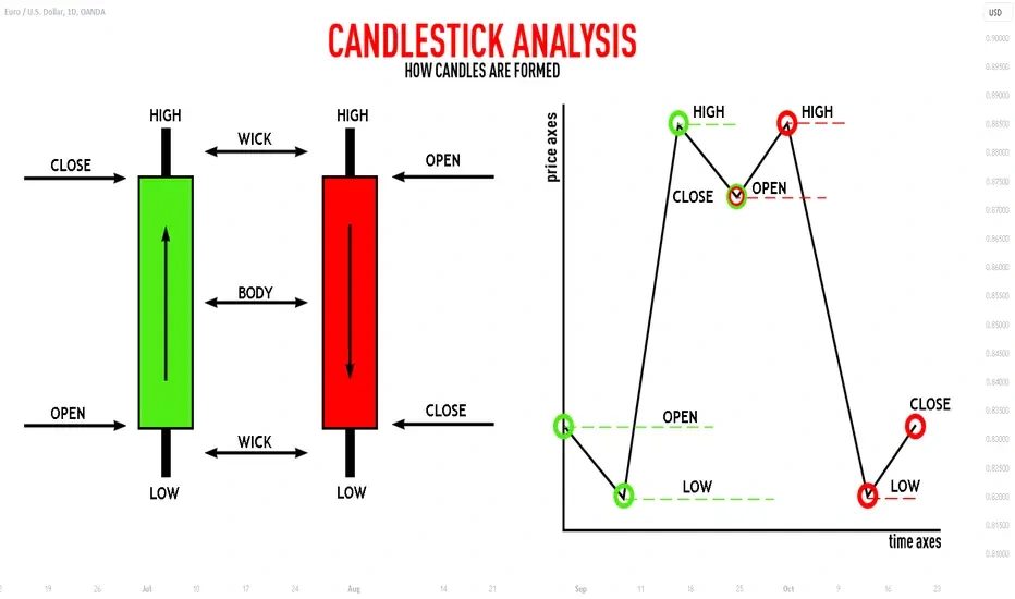
Credit from TradingView
Candlesticks are central to most technical analysis in crypto. Their shape and size can reveal a lot about market sentiment. For example, a long green candle suggests strong buying interest, while a small-bodied candle with long wicks shows indecision — buyers and sellers pushing against each other but failing to gain control.
Patterns emerge when multiple candles appear in a certain sequence. A hammer candle after a decline might signal that the market is about to turn bullish. A shooting star after an uptrend could suggest that sellers are starting to push back.
What matters most isn’t a single candle but the story candles tell in groups — especially near important price levels.
Support and Resistance: Key Price Zones
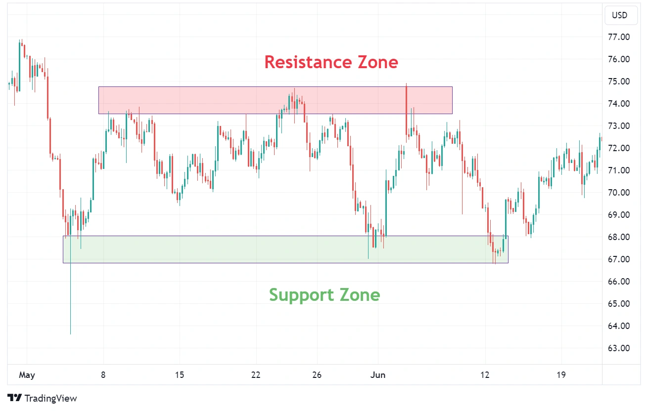
Credit from Axi
Support and resistance are horizontal price levels where the market tends to reverse or stall. Support acts like a floor — price often bounces back up when it hits this level. Resistance, on the other hand, acts like a ceiling that price struggles to break through.
These levels form naturally from previous highs and lows and are often watched by thousands of traders. That collective attention gives them weight. When price breaks through support or resistance with high volume, it can signal the start of a new trend. These levels can even “flip” — what was once resistance can become new support if price climbs above it and holds.
Trendlines and Directional Movement
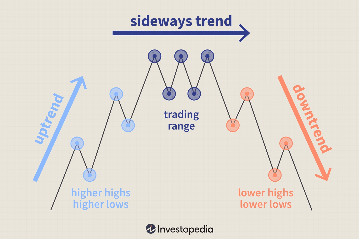
Credit from Investopedia
Every market moves in trends — either up, down, or sideways. A clear uptrend consists of higher highs and higher lows. A downtrend shows lower highs and lower lows. In sideways movement, the price moves within a tight range.
You can draw trendlines along the peaks in a downtrend or the troughs in an uptrend to get a clearer sense of where the market is moving. These trendlines are subjective, but the more times the price touches them without breaking, the more valid they become.
Understanding the broader trend helps traders avoid going against the market’s momentum — a common mistake among beginners.
Introducing Technical Indicators
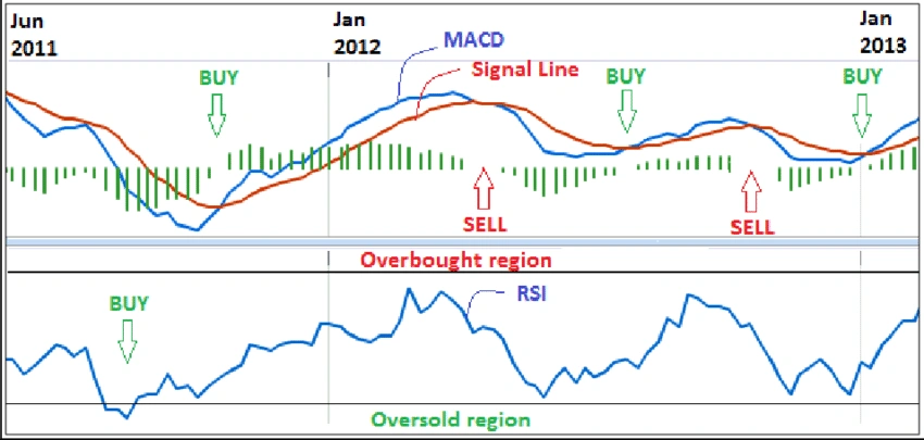
Credit from ResearchGate
Technical indicators are tools that apply mathematical formulas to price and volume data to offer insight into market conditions. While they don’t predict the future, they can help confirm what the price chart is already showing.
Three beginner-friendly indicators are:
- Moving Averages (MA): These smooth out price action and help identify trend direction. A common approach is watching for crossovers — for example, when the short-term average crosses above the long-term average, it can be a bullish sign.
- Relative Strength Index (RSI): RSI measures the strength and speed of price movements. A value above 70 can mean the asset is overbought; below 30 might suggest it’s oversold. It helps identify possible reversals or momentum fades.
- MACD (Moving Average Convergence Divergence): This tool shows the relationship between two moving averages. It’s useful for spotting changes in momentum and is often used with a histogram that visually represents the strength of the trend.
These indicators are most effective when used in combination with candlestick analysis and trendlines.
Table: Recent BTC/USDT Daily Candlestick Data
| Date | Open | High | Low | Close | Volume (BTC) |
|---|---|---|---|---|---|
| Aug 1, 2025 | 62,800 | 63,400 | 61,900 | 62,200 | 25,400 |
| Aug 2, 2025 | 62,200 | 62,700 | 60,800 | 61,300 | 28,100 |
| Aug 3, 2025 | 61,300 | 63,100 | 60,900 | 62,700 | 30,800 |
| Aug 4, 2025 | 62,700 | 64,000 | 62,000 | 63,900 | 27,500 |
From this data, you can see how daily price changes are linked to volume. For example, strong closing prices paired with increasing volume can confirm bullish sentiment.
Recognizing Classic Chart Patterns
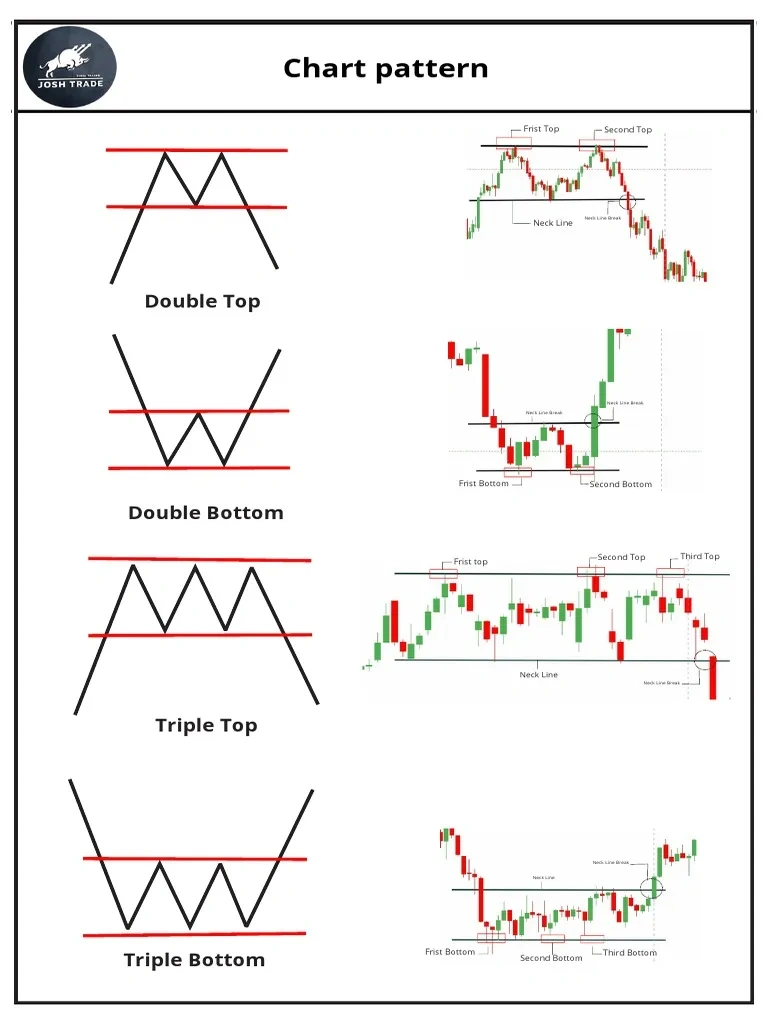
Credit from Scribd
Beyond candlesticks and indicators, broader chart patterns also help traders understand what the market might do next. Patterns like double tops or double bottoms occur when price fails to break through a level twice, often signaling reversal. The head and shoulders formation is another reversal pattern that suggests a loss of momentum.
On the other hand, triangles, flags, and pennants are often continuation patterns. These indicate short pauses before the price continues in its original direction. Spotting these early can help traders prepare for breakouts.
Patterns are easier to recognize on longer timeframes like the 4-hour or daily chart, and they’re more reliable when combined with volume or RSI confirmation.
Putting It All Together: Reading Your First Chart
To practice, open a Bitcoin chart on a platform like TradingView. Set the timeframe to 1D (daily). Add a 50-day moving average and RSI indicator. Now:
- Look at the current trend — is it up, down, or sideways?
- Identify support and resistance zones from recent highs and lows.
- Check if there are any obvious candlestick formations or chart patterns.
- Use RSI to evaluate whether the asset might be overbought or oversold.
This approach gives you a simple framework to start understanding price behavior, without relying on guesswork or hype.
Conclusion: Reading Crypto Charts Is a Skill, Not a Shortcut
Learning how to read crypto charts takes time and observation. But even a basic understanding can dramatically improve your ability to make confident decisions in the market. Whether you’re trading or just managing a long-term portfolio, charts give you a clearer view of what the market is doing — and what it might do next.
Remember, technical analysis isn’t about perfect predictions. It’s about managing probability and risk in a fast-moving environment. The more you read and review charts, the more intuitive they become — and the more empowered you’ll feel navigating the world of crypto.

